19 Room Color Combination Ideas
Let’s be honest: choosing the right color combination for your room is no less complex than solving a Rubik’s cube blindfolded.
You think you know what works—until you actually put that blush pink next to that navy blue and realize it looks like a bruise.
I’ve been there—standing in the middle of a half-painted room with a roller in one hand and regret in the other.
1. Classic White and Navy Blue
This duo is the Audrey Hepburn of room colors—timeless, crisp, and endlessly chic. Navy brings depth, while white balances it with brightness. Perfect for bedrooms or home offices, it gives you that clean, smart atmosphere without feeling sterile.
Pro tip: Pair with brushed brass hardware or wooden furniture for that magazine-cover look.
2. Charcoal Grey and Mustard Yellow
This combo is like a rainy day with a surprise patch of sunshine. The charcoal grey provides a moody, modern foundation, while mustard yellow injects warmth and energy without being too loud.
I once painted a reading nook in these colors. Even on gloomy days, it felt like curling up with a cup of chai in a London café. Try it in your living room to add personality and drama.
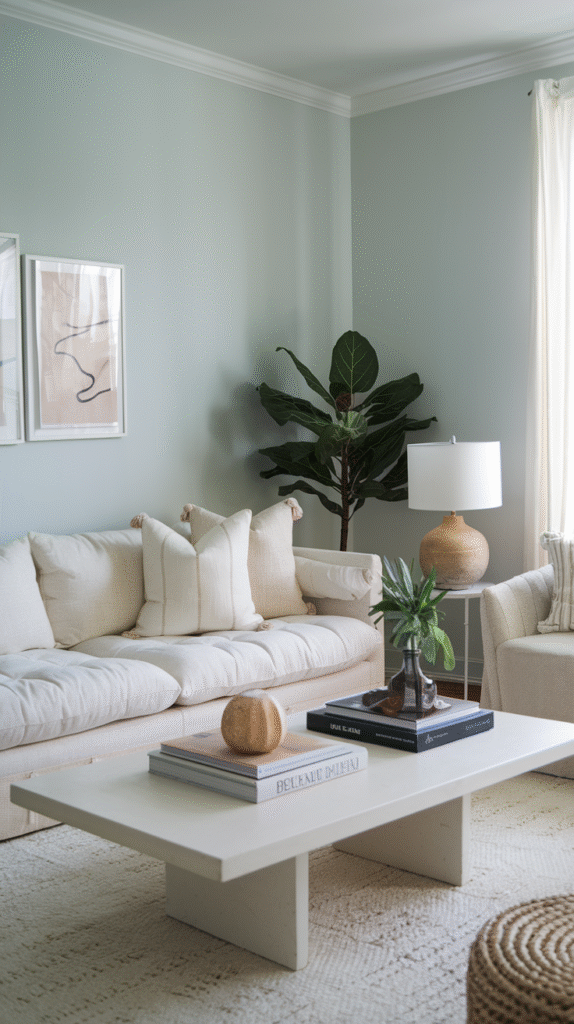
3. Sage Green and Cream

Sage green is the color equivalent of a deep breath—it soothes the mind and calms the senses. When paired with soft cream, you get a gentle, organic look that feels like nature just stepped inside for a visit.
This pairing is great for bathrooms or bedrooms. Add in some rattan or bamboo elements for an earth-toned retreat.
4. Terracotta and Ivory
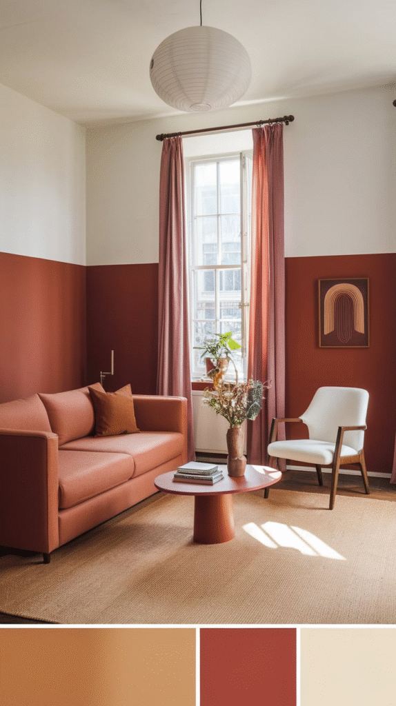
Here’s a combo with soul. Terracotta, inspired by sunbaked clay, and ivory, soft and serene, create a Mediterranean vibe that feels both cozy and cultured.
This pairing works beautifully in dining rooms or kitchens, especially if you have terracotta tiles or rustic wooden features. It feels warm, lived-in, and full of stories—just like Nonna’s kitchen.
5. Dusty Rose and Olive Green
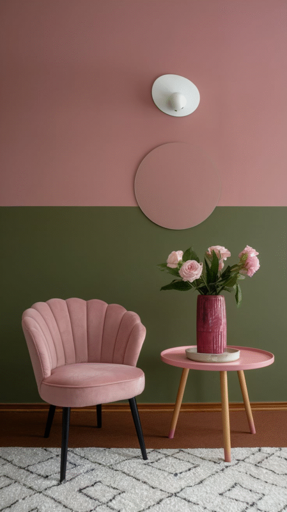
This isn’t your grandma’s floral wallpaper. Dusty rose, a muted pink, and olive green, a grounded earthy tone, feel sophisticated yet inviting.
Used together, they bring a certain vintage elegance. Ideal for bedrooms, sitting areas, or even hallways where you want softness without being saccharine.
6. Peach and Teal
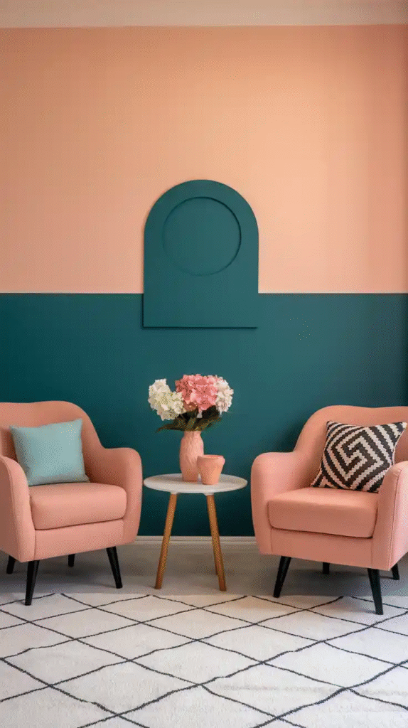
Think tropical but refined. Peach adds a soft warmth, while teal brings the cool. Together, they offer a dynamic contrast that feels vibrant but balanced.
I once used this combo in a guest room, and people always said it “felt like vacation.” If you want playful with a touch of polish, this is your match.
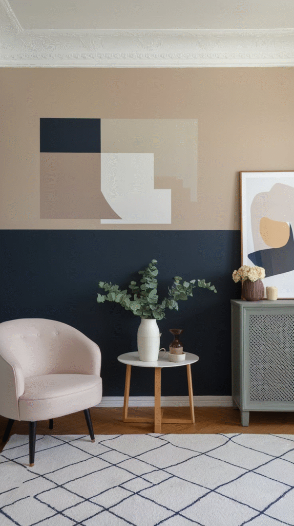
7. Taupe and Black
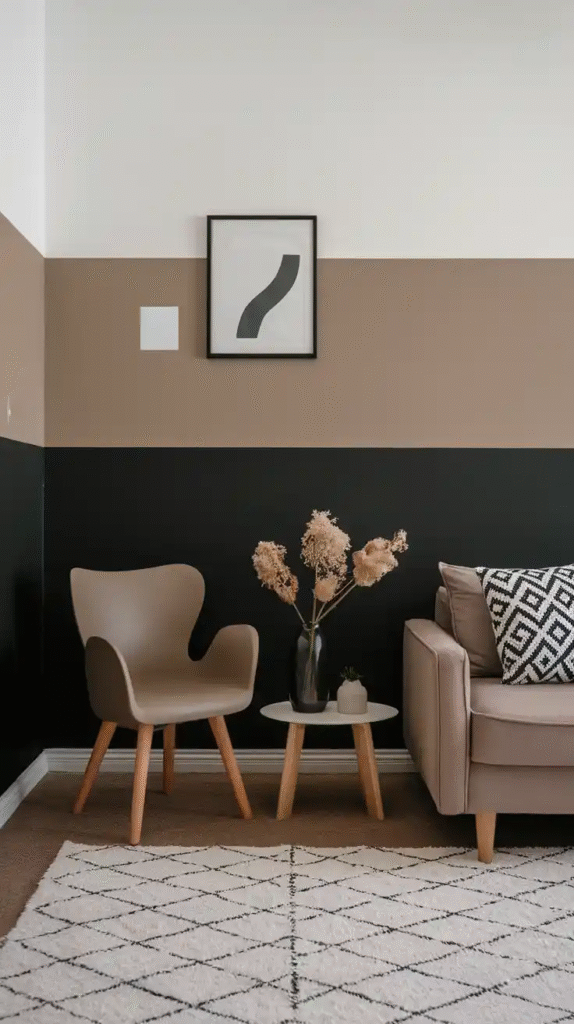
Sometimes simplicity speaks the loudest. Taupe, a warm neutral, combined with matte black gives you a minimalist yet high-impact aesthetic.
Ideal for modern spaces, especially living rooms or entryways. The key is keeping textures interesting—velvet, leather, raw wood, anything to avoid it looking flat.
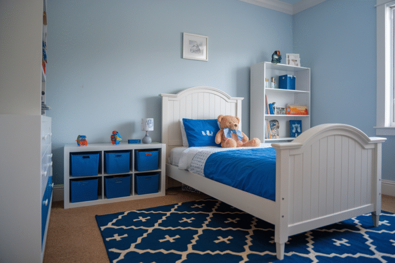
8. Sky Blue and White
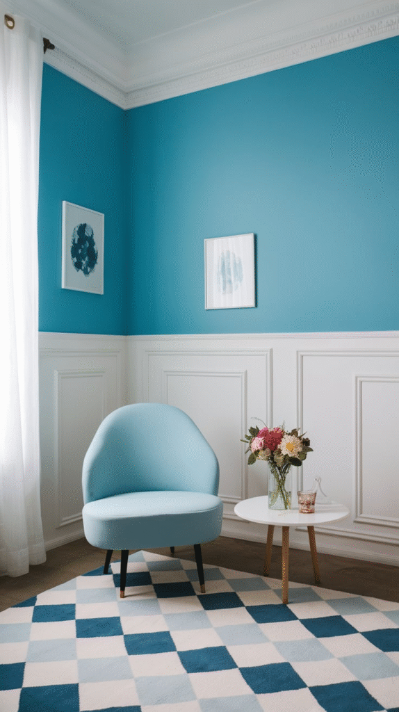
This one’s like waking up in a fresh hotel room by the beach. Sky blue evokes openness and light, while white reflects purity and space.
Great for small rooms, especially kids’ rooms, bathrooms, or even laundry rooms, where you want things to feel fresh and uncluttered.
9. Burnt Orange and Deep Brown
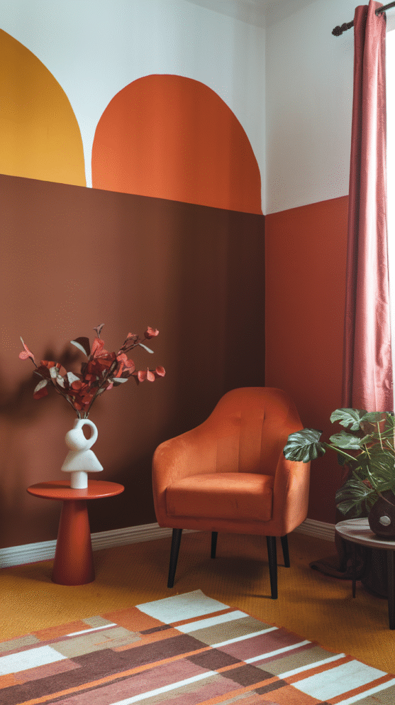
This combination feels like autumn cozied up and never left. Burnt orange offers warmth and flair, while deep brown adds richness and grounding.
Perfect for a study or den, especially with leather chairs, vintage books, and mood lighting. It’s got that fireside-glass-of-whiskey energy.
10. Lilac and Grey
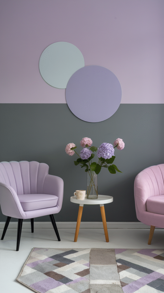
If you’re after subtle romance, look no further. Lilac, a pale purple, paired with soft grey, brings lightness without overwhelming sweetness.
Try this in a guest bedroom or dressing area. Add silver or glass accents for a whimsical, airy feel.
11. Emerald Green and Gold
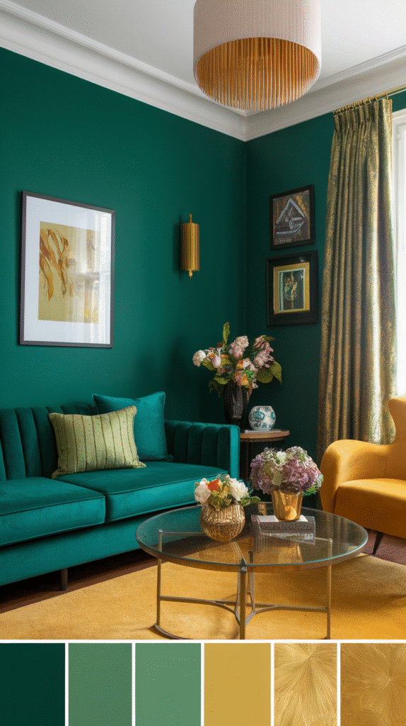
Luxurious. Regal. Dramatic. Emerald green paired with gold creates a space that feels like it belongs in an old Hollywood movie set.
Used wisely, this combo turns any room—especially dining rooms or formal living rooms—into a showstopper. Just keep clutter minimal to let the colors shine.
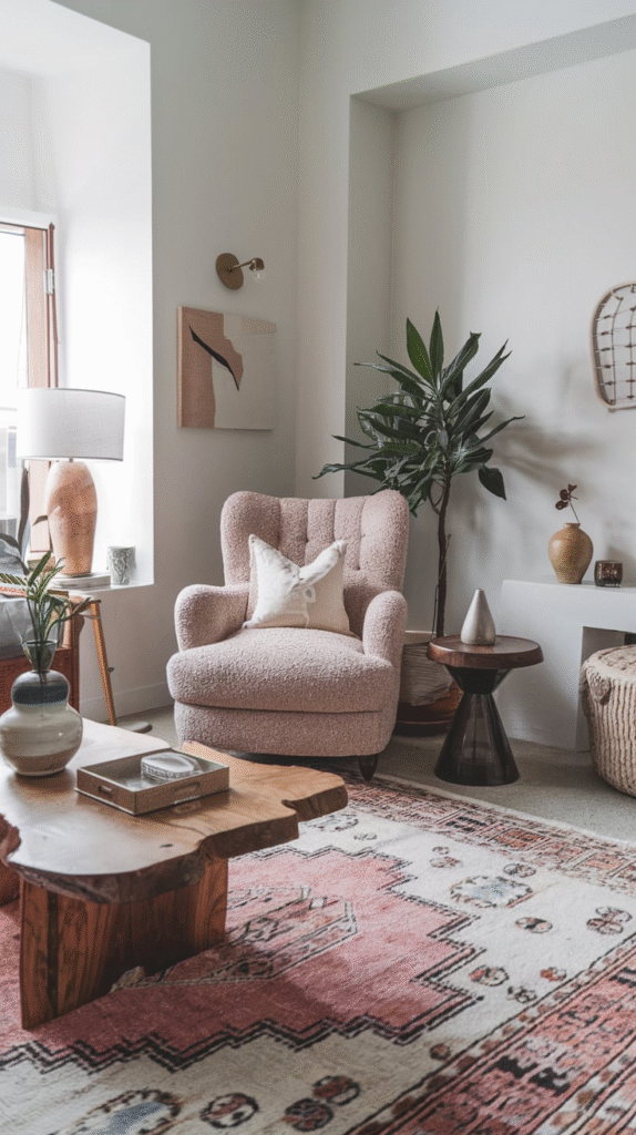
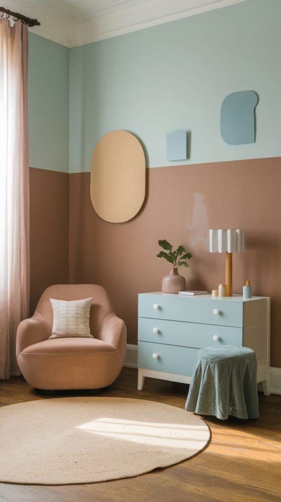
12. Beige and Blush
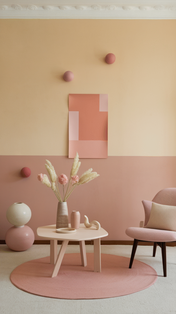
Soft, warm, and endlessly versatile. Beige and blush together feel like morning sunlight through sheer curtains.
This is perfect for nurseries, bedrooms, or cozy corners. It’s like living inside a sepia-toned memory—subtle, nostalgic, and comforting.
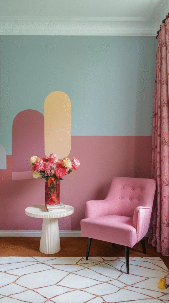
13. Dark Teal and Soft Pink
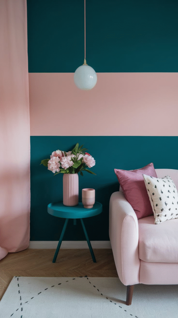
Talk about opposites attracting. Dark teal adds weight and sophistication, while soft pink provides contrast and lightness.
Use it in a bold powder room or a modern bedroom. The trick is balance—too much pink and it becomes a candy shop; too much teal and it feels heavy. Together, though? Harmony.
14. Matte Black and White
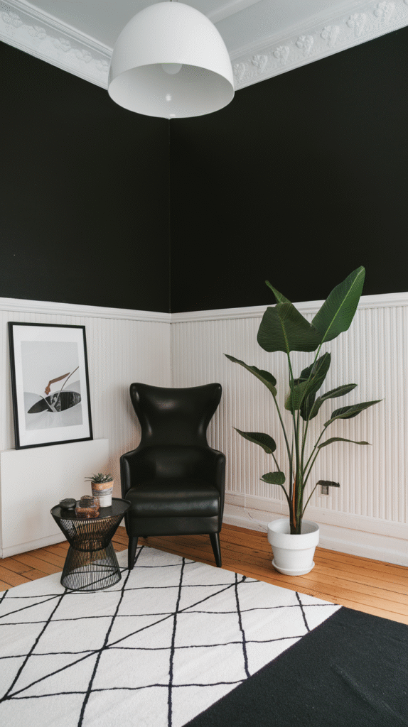
The boldest of the basics. Matte black and white is striking, clean, and deeply modern.
Ideal for kitchens, bathrooms, or contemporary living spaces. Add wood or metal touches to prevent it from feeling too clinical. The contrast is sharp, confident, and stylish.
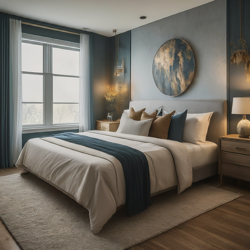
15. Mocha and Pale Blue
Imagine sipping coffee under a pale morning sky. That’s the mood of mocha brown paired with pale blue—calm, grounded, and deliciously mellow.
Perfect for home offices or living rooms. Add textured textiles or vintage rugs for a lived-in feel.
16. Forest Green and Warm White
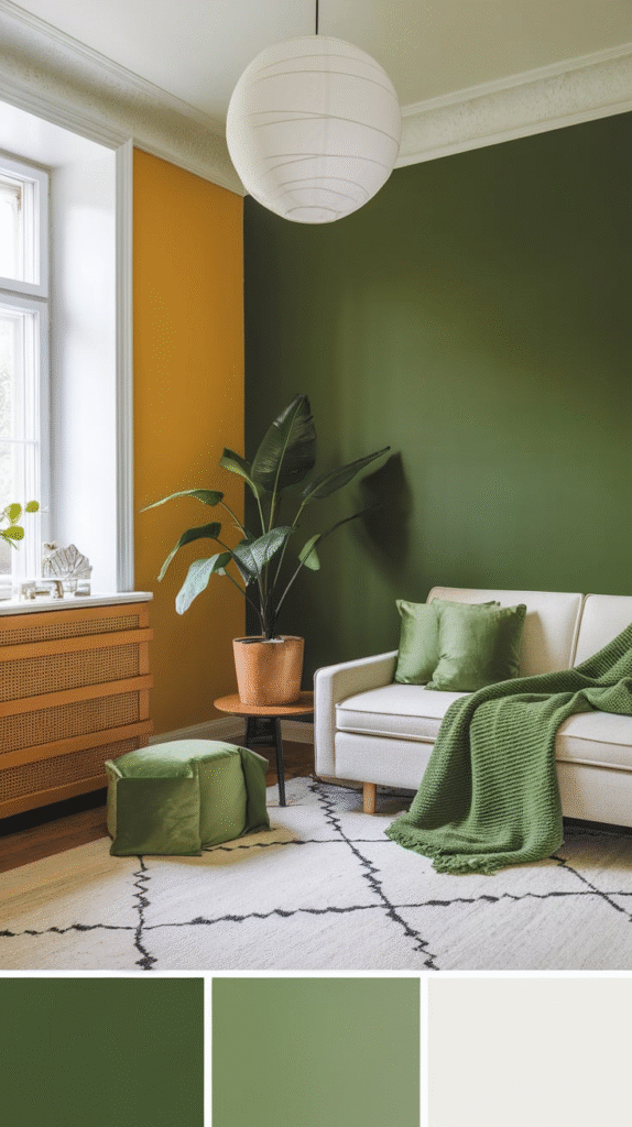
There’s something timeless about this combination. Forest green gives depth and elegance, while warm white prevents the space from feeling too heavy.
Excellent for library-style rooms, bedrooms, or living rooms with natural light. Add dark wood, leather-bound books, and maybe a reading chair to complete the scene.
17. Plum and Beige
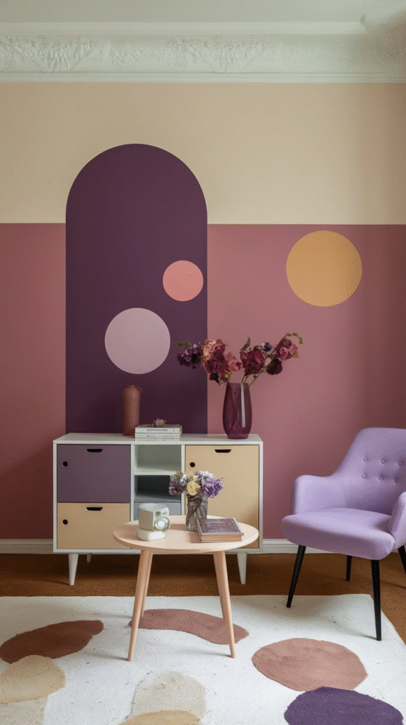
Bold meets neutral. Plum, a deep wine shade, offers richness, while beige keeps the space calm and grounded.
Great for formal dining areas, living rooms, or master bedrooms. Add brass fixtures and soft lighting to amplify the elegance.
18. Powder Blue and Coral
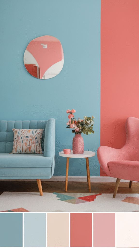
Soft meets spunky. Powder blue feels light and airy, while coral brings fun energy into the mix.
It’s a fantastic combination for a kid’s room, creative space, or sunroom. It sparks creativity while still feeling soft and inviting.
19. Greige and Navy
Can’t choose between grey and beige? Go greige. When paired with navy, it creates a look that’s smart, adaptable, and surprisingly warm.
Perfect for multi-use spaces or open-plan living, this combination supports both style and function. Add copper or aged bronze hardware to complete the look.
Conclusion
The truth is, there’s no “right” or “wrong” color combo—there’s only what feels right for you. Your room should feel like an extension of your personality, not a page out of a catalog. Use these combinations as launchpads, not limits.
When I painted my first apartment’s living room a soft sage green with cream trim, I thought, “This feels like exhaling.” And that’s what you’re after—not just style, but feeling. Energy, emotion, and experience all tied into the hues you choose.