
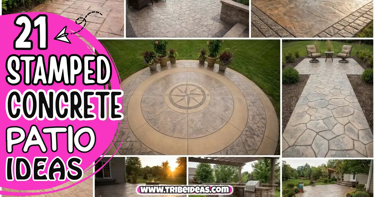
My first stamped concrete quote was for a “slate” pattern that, when the contractor finally sent photos of a finished job, looked like someone had pressed a waffle iron into wet cement and called it a day.
I almost signed anyway because I was tired of looking at bids. I didn’t, and six months later I have a patio I actually like, mostly because I learned the hard way that “stamped concrete” isn’t one product — it’s a technique with about forty different looks depending on the stamp pattern, the color method, and honestly, how good your contractor is at their job.
If you’re standing in your backyard right now looking at a cracked slab or bare dirt and trying to figure out what a stamped concrete patio could actually look like for your space, this is the post I wish I’d had before I started calling contractors.
I’m going to walk through real pattern and layout ideas — not just “here’s a pretty photo” — plus what things actually cost, what I’d tell you to ask a contractor before you sign anything, and which ideas work for a small backyard versus a bigger one.
One thing up front: stamped concrete patio ideas live and die by execution, way more than most home improvement projects. The exact same stamp pattern can look incredible or genuinely bad depending on the color work and the contractor’s skill, so treat this list as a starting point for what to ask for, not a guarantee of what you’ll get.
What Drives the Look (Read This Before You Start Picking Patterns)
Before the list — three things determine how your finished patio actually looks, and most posts skip straight to “here are pretty patterns” without explaining this part.
The stamp pattern is the texture pressed into the wet concrete — this is what most people mean when they say “stamped concrete ideas,” things like ashlar slate, wood plank, or running bond brick.
The color method matters just as much as the pattern. Integral color (mixed into the concrete before pouring) gives a flatter, more uniform tone. A color hardener plus an acid stain or antiquing release adds depth and variation — this is the difference between a patio that looks like painted concrete and one that actually reads as stone from six feet away.
The layout and borders — where the patio sits, how it’s shaped, and whether it has a contrasting border — do more to make a patio look designed rather than just poured than the stamp pattern itself does.
Stamped Concrete Pattern Ideas
1. Ashlar Slate
Why it matters: This is the most popular stamp pattern for a reason — the irregular, large-format stone shapes hide small imperfections in the pour better than a uniform pattern would, which matters if your contractor is good but not a perfectionist.
How to do it: Ask specifically for a “random ashlar” stamp set, not a repeating one — cheaper jobs sometimes use a single stamp repeated in an obvious grid, and your eye catches the repeat immediately once you know to look for it.
Pro tip: Stand at the stamp sample board from about eight feet away, not two feet — that’s the distance you’ll actually view your finished patio from most of the time, and patterns that look great up close sometimes look flat or busy from a normal viewing distance.
2. Wood Plank Stamped Concrete
Why it matters: This gives you the look of a wood deck — including the specific appeal of long linear boards — without the maintenance of actual wood, no re-staining every couple of summers, no rot risk near sprinklers.
How to do it: The plank direction matters more here than with stone patterns — running the “boards” toward your house’s main sightline (from the back door, say) reads more intentional than running them parallel to the fence line.
The trade-off: Up close, in direct sun, you can tell it’s concrete — the wood grain texture doesn’t fully disappear the illusion the way it might in photos. It reads best from a normal walking distance, not from a chair three feet away staring at the texture.
3. Running Bond Brick
Why it matters: If your house has any brick on the exterior, this pattern ties the patio to the house in a way that random stone patterns don’t — my neighbor did this specifically to match her 1960s brick ranch and it looks like it was always part of the house.
How to do it: Match your mortar-line color, not your brick color, to your house’s existing brick if you’re going for the tie-in look — the color hardener manufacturers sell specifically for mortar-line gray, and it makes a bigger visual difference than most people expect.
Pro tip: This pattern shows tire marks and scuffs more visibly than irregular stone patterns because the straight lines make any smudge more obvious — factor that in if this patio doubles as a spot where you’ll park a grill or move furniture around often.
4. Herringbone Brick
Why it matters: More visually interesting than running bond without going as bold as a full custom mosaic, herringbone is the pattern I’d pick if I wanted “designed” to be the first word someone used, not “nice.”
How to do it: This pattern is genuinely harder to stamp cleanly than running bond because of all the angle changes, so ask to see a full finished herringbone job, not just a sample board — this is one where contractor skill really shows.
The trade-off: Expect to pay slightly more in labor for this pattern specifically, since it takes longer and more care to stamp than a straight-line pattern.
5. Cobblestone
Why it matters: Cobblestone gives you a European courtyard feel and hides dirt and leaf debris better than smoother patterns, which is a real practical win if you’ve got trees nearby.
How to do it: Go with a muted, earthy color palette here — grays and browns — rather than anything too saturated, because cobblestone reads “fake” fastest when the color is too uniform or too bright.
6. Large Format Square Tile
Why it matters: If your house has a modern or minimalist look, a large-format square pattern reads cleaner and more architectural than any of the “natural stone” patterns above.
How to do it: Fewer, bigger stamps mean fewer seam lines, which is exactly the point — but it also means less forgiveness for an uneven pour, so this is a pattern where I’d specifically ask about the contractor’s screed and leveling process before hiring.
Pro tip: Add a contrasting score line — a thin recessed line between “tiles,” done with a hand groover rather than the main stamp — and it looks noticeably more custom for almost no added cost.
7. Fieldstone
Why it matters: More irregular and rustic than ashlar slate, fieldstone is the pattern for a cottage or farmhouse-style backyard rather than a clean modern one.
How to do it: This pattern benefits the most from a multi-tone color application (a base color plus a darker antiquing release rubbed into the crevices) because the irregular shapes create natural shadow lines that flat color doesn’t do justice to.
The trade-off: The uneven surface texture can actually be a little uncomfortable barefoot compared to smoother patterns — worth knowing if this patio is going right off a pool.
Layout & Zoning Ideas
8. Two-Tier Patio for a Sloped Yard
Why it matters: If your backyard slopes at all, a single flat stamped patio either requires a lot of expensive grading or ends up feeling awkwardly perched — a two-tier design works with the slope instead of fighting it.
How to do it: Use a contrasting stamp pattern or color between tiers, not just a change in elevation, so the two levels read as an intentional design choice rather than “we ran out of room and had to step it.”
Pro tip: Put your grill or outdoor kitchen zone on the lower tier if it’s closer to the house — nobody wants to carry a tray of food up a step every trip.
9. Curved Border Instead of Straight Edges
Why it matters: A rectangular slab reads like a driveway extension. A patio with even one gently curved edge, especially where it meets the lawn, reads like it was actually designed for the yard.
How to do it: Curves cost slightly more in formwork labor, so this is a case where telling your contractor upfront (“I want at least one curved edge”) matters before they quote a straight-edge job and then upcharge you for a change order.
10. Fire Pit Circle Cut-Out
Why it matters: A dedicated circular zone for a fire pit, done in a different pattern or color than the main patio, gives you a natural gathering spot without needing a separate paver project.
How to do it: Leave at least a 3-foot buffer of patio material around any fire pit for seating and safety clearance — I’ve seen people cram this too close to a fence or planting bed and regret it the first time they actually use the fire pit with a group of people.
The trade-off: If you’re using a wood-burning fire pit rather than gas, ask your contractor about heat-resistant sealer specifically — a standard sealer can discolor or bubble from consistent heat exposure over a season or two.
11. Sunken Conversation Pit Patio
Why it matters: This is a bigger commitment, but a sunken seating area — a few steps down from the main patio level — creates a genuinely cozy, enclosed feeling that a flat patio can’t replicate.
How to do it: Drainage is the thing to get right here — a sunken area needs a real drainage plan (French drain or a slight slope to a drain point), not just “it’ll be fine,” or you’ll have standing water after every storm.
12. Patio-to-Walkway Continuous Design
Why it matters: Extending the same stamp pattern from your patio into a connecting front or side walkway makes the whole property feel cohesively designed instead of like separate projects done at different times.
How to do it: This only works well if you’re doing both areas at once, or if you kept detailed records (color codes, stamp pattern names) from the original job — matching an existing stamped patio years later is genuinely difficult even for a good contractor, because concrete color mixes vary by batch.
13. L-Shaped Wraparound Patio
Why it matters: If your house has a corner that gets both morning and evening sun, an L-shaped patio lets you actually use both — coffee on one side in the morning, dinner on the other as the sun moves.
How to do it: Plan your furniture zones before the pour, not after — where the L-shape “bends” is usually the best spot for a dining table since it’s visible from both wings of the patio.
Color & Finish Ideas
14. Earth-Tone Multi-Color Blend
Why it matters: A single flat color is the fastest way to make stamped concrete look cheap. A blended earth-tone finish — tan base with a brown or charcoal antiquing release — is what separates a good-looking job from a mediocre one, more than the stamp pattern choice does.
How to do it: Ask to see the antiquing release color on an actual cured sample, not just a color chart — release colors shift noticeably once they’re sealed, and chart swatches don’t show that.
Pro tip: My contractor did a test pour on a scrap slab behind my garage before doing the actual patio — cost me nothing extra, and it’s the reason I caught that my first color choice looked way too orange once it cured. Ask for this if your contractor doesn’t offer it.
15. Charcoal/Slate Gray Modern Finish
Why it matters: A darker, more monochromatic gray finish pairs well with modern house exteriors and shows less visible staining from leaves, dirt, and grill grease than lighter tan tones.
How to do it: Dark colors absorb more heat, so if this patio gets full afternoon sun and you plan to walk on it barefoot, factor that into your color choice — my sister went with a near-black charcoal in Phoenix and regrets it every July.
16. Terracotta / Warm Southwest Tones
Why it matters: For homes with stucco exteriors or a Southwest/Mediterranean style, warm terracotta and rust tones tie the patio into the house’s existing palette far better than gray ever will.
How to do it: Pair this with a fieldstone or cobblestone pattern rather than a clean geometric one — the warm tones read most authentically with irregular, rustic shapes.
17. Two-Tone Border Accent
Why it matters: A contrasting border — a different color or even just a different stamp pattern around the perimeter — is one of the cheapest upgrades that makes the biggest visual difference, because it frames the whole patio like a rug frames a room.
How to do it: Keep the border width proportional to the patio size — a border that’s too wide on a small patio ends up looking like the “real” patio is just the small center section, which defeats the purpose.
Small Backyard Specific Ideas
18. Single Focal Pattern Instead of Multiple Zones
Why it matters: In a small backyard, trying to cram in a fire pit zone, a dining zone, and a lounge zone in different patterns just makes the space feel busy and smaller. One pattern, one color, done well, actually makes a small patio feel bigger.
How to do it: Use furniture and planters to create the zoning instead of the concrete itself — it’s more flexible if you rearrange later, and it keeps the hardscape simple.
Pro tip: Lighter colors genuinely do make a small space feel larger and cooler underfoot — if your patio is under 200 square feet, I’d lean tan or light gray over a dark charcoal, both for the visual space and for comfort.
19. Diagonal Pattern Orientation
Why it matters: Running your stamp pattern on a diagonal relative to your house rather than square with it is a classic trick for making a small rectangular patio feel less like a narrow hallway.
How to do it: This does create more waste in cutting at the edges, so expect a slightly higher material cost — worth mentioning to your contractor upfront so it’s not a surprise on the final invoice.
Larger Backyard / Statement Ideas
20. Combination Stamped + Exposed Aggregate Border
Why it matters: For a bigger patio, combining stamped concrete in the main area with an exposed aggregate (the pebbly, textured finish) border or walking path adds visual and textural variety without needing a second material entirely.
How to do it: This requires more coordination during the pour since the two finishes are applied differently, so make sure whoever you hire has done this combination before, not just each finish separately.
21. Integrated Outdoor Kitchen Slab
Why it matters: For a larger patio, pouring the outdoor kitchen counter base and the patio surface as one continuous stamped and colored project — rather than adding a separate paver or brick kitchen island later — gives you a much more cohesive, high-end look.
How to do it: Plan your gas, electric, and water lines before the pour, not after — this is the single most common regret I hear from people who did the patio first and the outdoor kitchen as an afterthought a year later.
What Stamped Concrete Patios Actually Cost
Costs vary a lot by region and contractor, but here’s a rough range based on what I’ve seen quoted and paid across a few projects:
| Patio Size | Basic Single-Color Stamp | Multi-Color / Complex Pattern | Add-Ons (fire pit cutout, border, curves) |
|---|---|---|---|
| Small (under 200 sq ft) | $2,400–$4,000 | $4,000–$6,500 | +$400–$1,200 |
| Medium (200–400 sq ft) | $4,800–$8,000 | $8,000–$13,000 | +$800–$2,000 |
| Large (400+ sq ft) | $9,600+ | $16,000+ | +$1,500–$3,500+ |
A few things that reliably push cost up beyond the base square footage number: curved edges, multiple color applications, sunken or tiered sections, and any pattern requiring more detailed hand-stamping (herringbone, large-format tile with score lines). If a quote comes in dramatically lower than others for the same square footage and pattern, ask specifically what color method they’re using — integral color alone is cheaper than a full color hardener plus antiquing release, and that difference alone can explain a big gap between bids.
Questions to Ask Before You Sign a Contract
- How many stamped concrete patios have you personally poured in the last year, not just the company overall?
- Can I see a finished job with this exact stamp pattern and color combination in person, not just photos?
- What sealer do you use, and how often will it need to be reapplied?
- What’s your plan for control joints (the cut lines that prevent random cracking), and where will they be placed?
- Do you do a test pour or sample board on-site before the full pour?
What I’d Actually Do If I Were Starting Over
I’d spend less time picking the “prettiest” stamp pattern from a brochure and more time finding a contractor with strong, verifiable examples of their actual finished work, in person. The pattern matters, but I’ve learned that a mediocre contractor can make a great pattern look mediocre, and a great contractor can make a simple ashlar slate pattern look genuinely custom. If I were doing my patio again today, I’d go with the earth-tone ashlar slate, add the curved border I skipped the first time to save a little money, and I’d absolutely insist on that test pour on scrap concrete before committing to the final color — that one step alone would’ve saved me from a color mistake I lived with for two years before I finally had it resealed with a tint that actually worked.


Leave a Reply